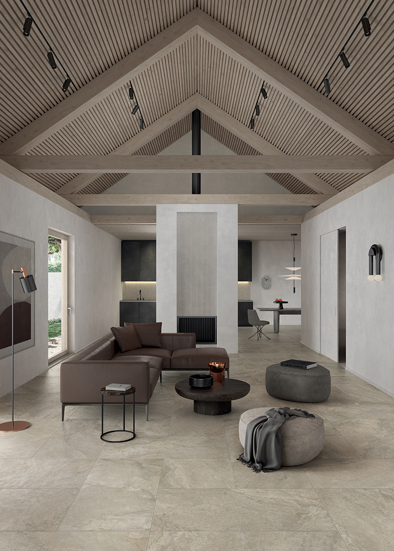
Design gurus and experts have declared 2024 the year of ton sur ton: combinations of monochromatic colour palettes and geometric shapes that create specific moods and atmospheres in interior spaces. A perfect synergy that embodies harmony between colours, a balanced study of tones inspired by the natural hues of the earth, Ton sur ton is about choosing a colour in different shades and using it throughout the room. From the walls to the furniture, from the curtains to the floors. Light and understated colours are often used. For a calm and minimalist look, go with white, off-white, dove grey, beige, or pastels. Of course, you can use any colour you like, as long as it’s repeated in different shades.
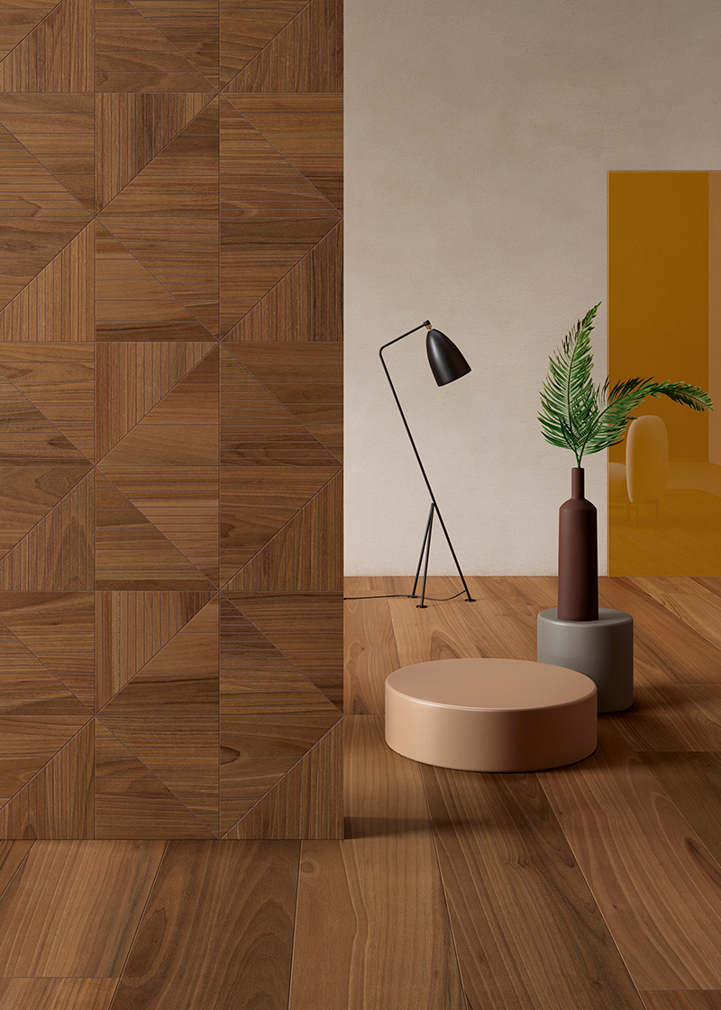
As the mantra of the vintage world states: “Everything old is new again”. This is the concept behind a retro style that uses deep and earthy browns, combined with shades and nuances that recall coffee and caramel, for a welcoming look that adds warmth and a touch of 1970s allure to even the most contemporary projects.
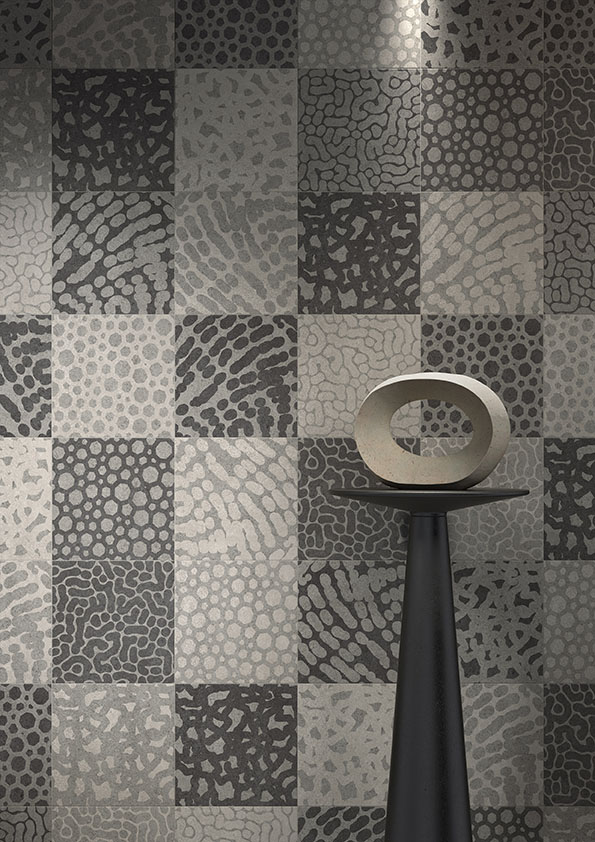
Ton sur ton with neutral colours, like beige and warm whites, balances interior spaces and makes a strong visual statement. Geometric patterns on walls that, clad in ceramic tiles or wallpaper, serve not only as a kind of scenery dividing open spaces, but also as focal points, helping to give a room a precise identity. Finally, the skilful and measured use of nuances for furniture, combined with the right lighting, makes a space feel welcoming and intimate.
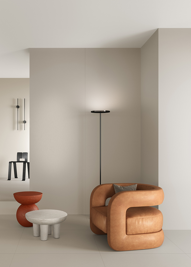
Modern, welcoming, and elegant: when used expertly, grey is a colour that can enhance a living space. Its timeless and trans-seasonal shades continue to be popular thanks to their minimalist aesthetic. Pearl grey is undoubtedly the brightest of the shades available. Capable of adding personality to even the simplest environments, it is suitable for almost any application: walls, cladding, floors, textiles, and furniture.
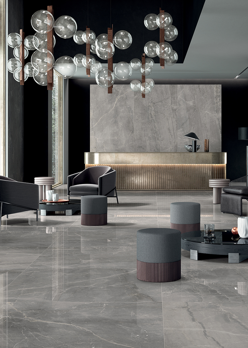
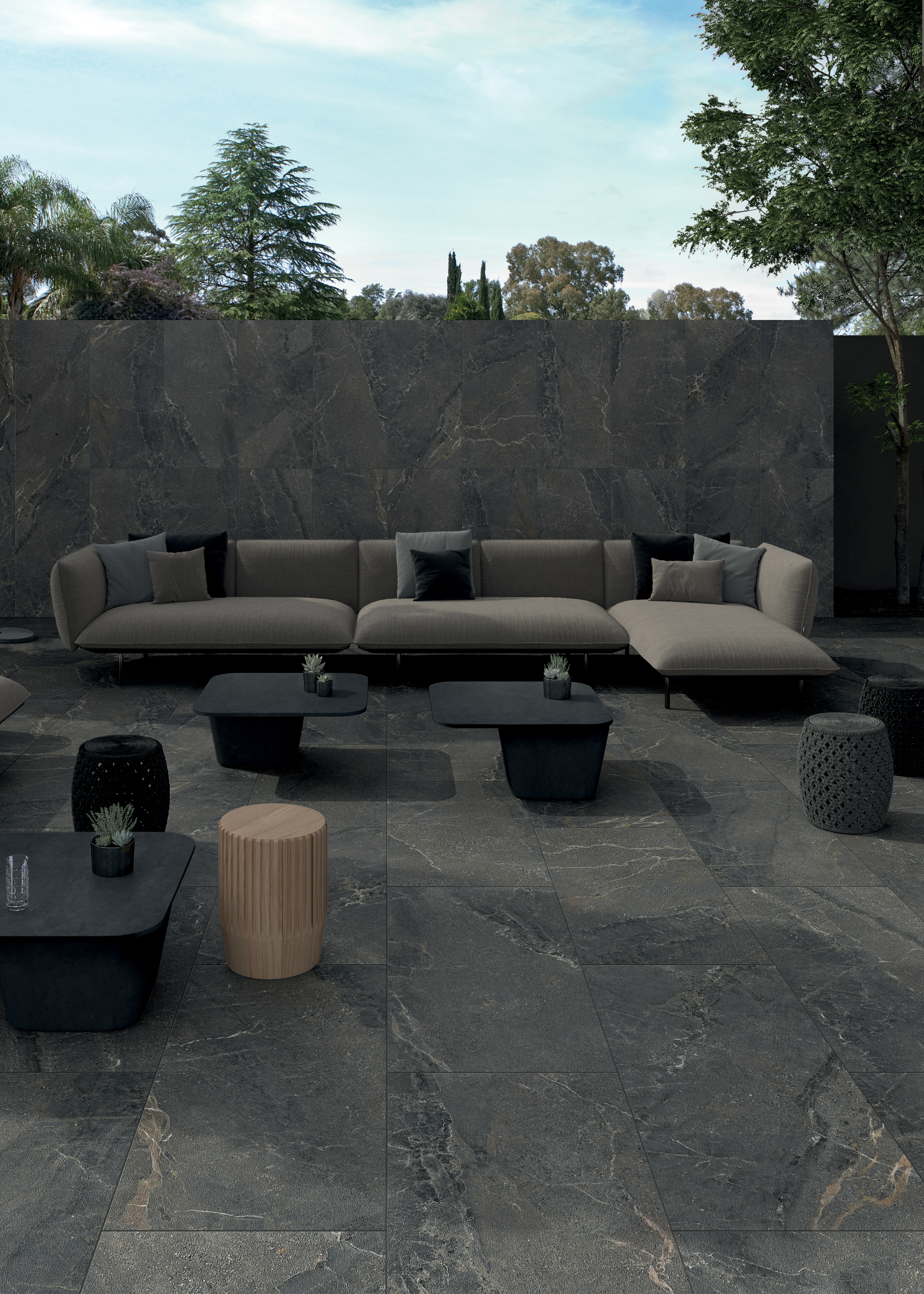
Surrender to the seductive power of dark colours, combining elegance and rebellion, this is the final chance to explore ton sur ton of neutral colours like black and dark grey. Explore the juxtaposition of surface textures and metallic finishes, as well as bands of light and shadow. The apparent absence of colour focuses the mind and heightens the senses. A palette of pitch black, ash grey, and charcoal grey will create a welcoming environment that stirs up ancestral memories while conveying a sense of profound intimacy.
With porcelain stoneware, an ultra-thin, durable, extremely versatile, and sustainable material that realistically reproduces the tactile and aesthetic sensations of wood, stone, and marble, allowing your imagination to run wild envisioning different interior styles becomes a creative exercise that uncovers endless possibilities. Lea Ceramiche, thanks to its penchant for design and innovation, offers some of its widest ranging collections, available in colours, sizes, and patterns to suit every design need.
By subscribing to the newsletter, you will receive exclusive promotions dedicated to you.